What’s in a Name? Having Fun with Data
by Sarah Lonberg-Lew
My name is Sarah. (If you don’t believe me, check the byline.) On my first day of high school, I met four other girls named Sarah. It has often been my experience to not be the only Sarah in a group, especially a group of people close to my age. I’ve had to add descriptors to my name to be able to be uniquely identified. I’ve been “short Sarah,” “Sarah short hair,” “Sarah L,” and on more than one occasion I’ve been “math Sarah.” If you also have a common name, you can probably relate.
Just how common is my first name? There is a fantastic internet tool that can answer that question for me with a wealth of interesting data. It is WolframAlpha, the computational search engine. If you are looking for quantitative information of any kind on the internet, this is a great place to look. One exciting thing this site can do is provide current and historical data about the popularity of a name. For example, here are some things I learned about my own name:
- About 1 out of every 303 people in the United States is named Sarah.
- There are about 909,700 Sarahs living in the United States right now. That means I may not be one-in-a-million, but I’m close!
- The most common age of a Sarah in the United States is 30.
WolframAlpha also showed me data that helped shed some light on why I so often have to qualify my name in large groups. This graph shows the popularity of my name over time:
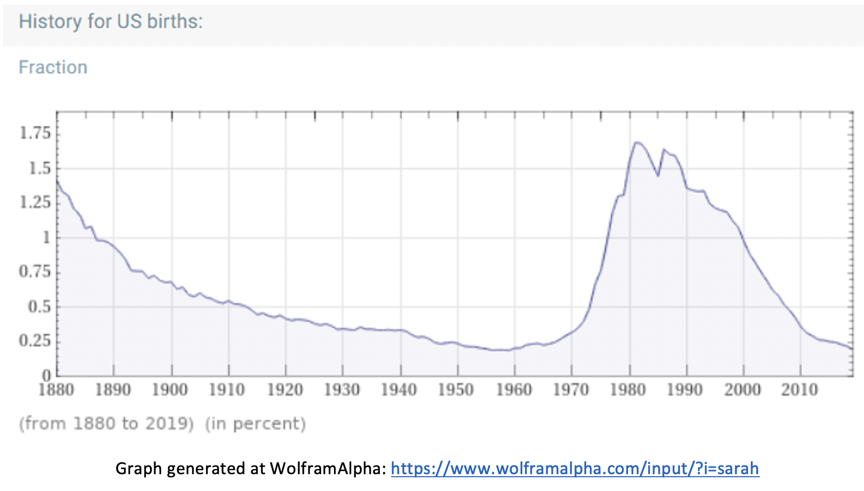
When I was born, my parents didn’t know that my name was getting more popular. Looking at this graph, I wonder if a lot of other parents might have been similarly unaware. Can you guess about when I was born?
The same site also provided a graph showing the age distribution of people with my name in the United States:
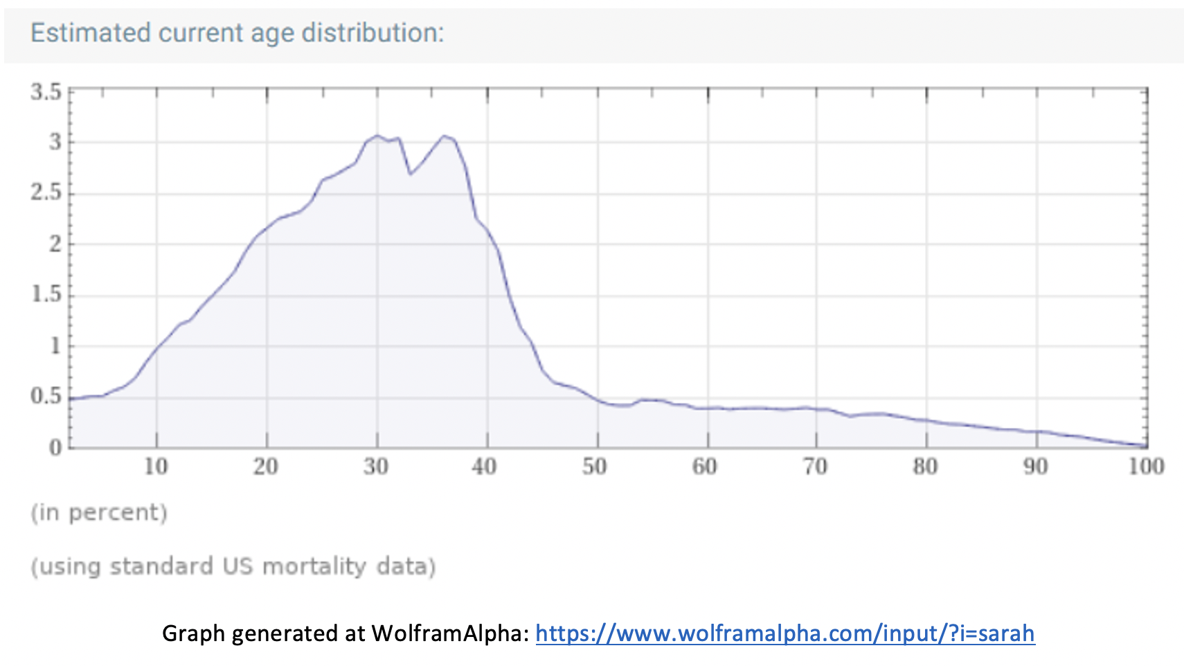
What do you notice about the two graphs? What do you wonder?
There are many mathematical avenues to explore within the name results at this website. Beyond looking up your own name or your students’ names, you can also compare multiple names. For example, here’s a graph that compares the popularity of my name with the name Donna (the name of the esteemed director of the Adult Numeracy Center):
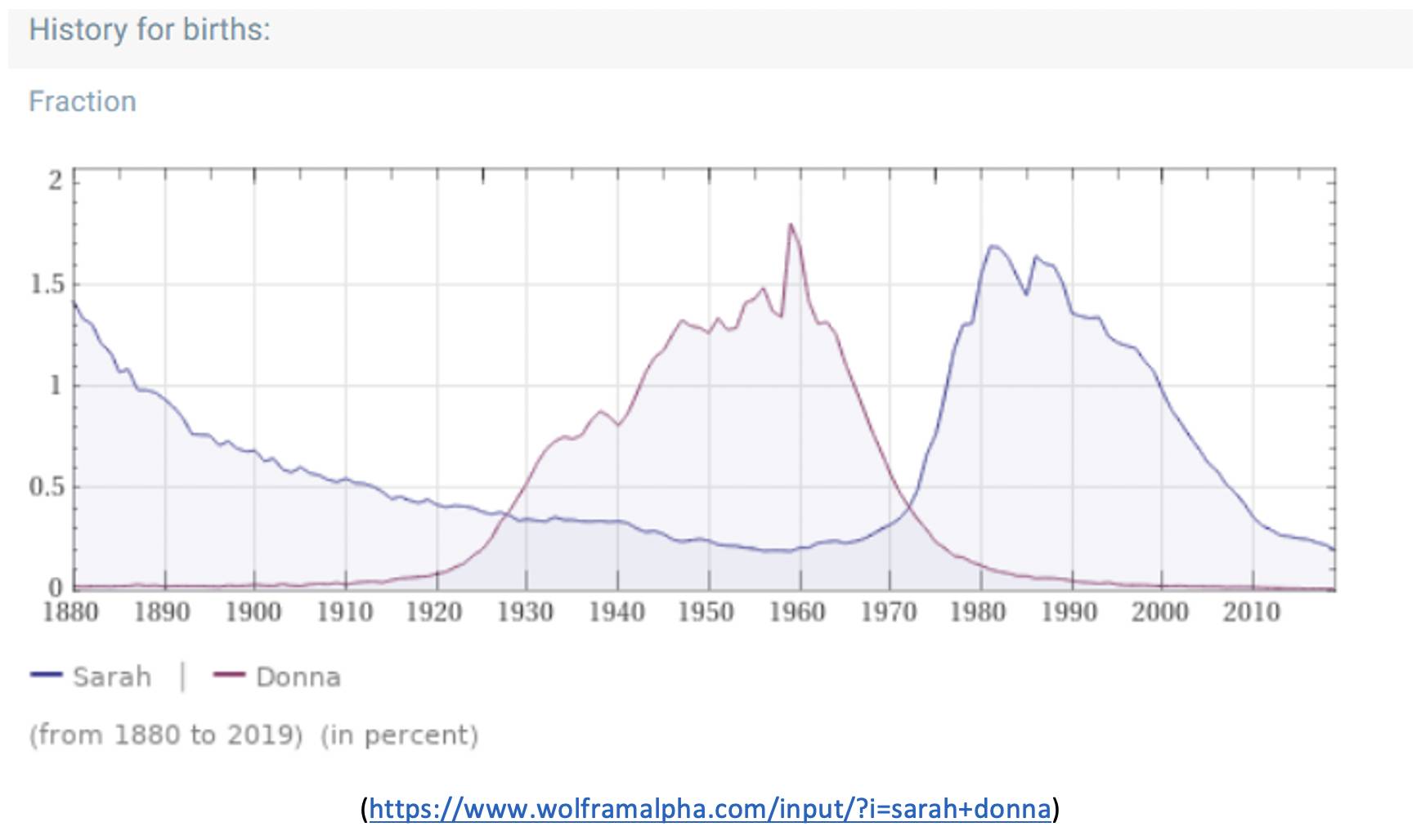
What do you notice about this graph? What do you wonder about? One thing I wonder about is whether the Ritchie Valens 1958 hit song “Oh Donna” had anything to do with the name’s popularity. What do you think?
The trends in naming babies can reflect what is going on in the world as well as what is popular in music, literature, movies, or TV shows. Here’s a striking example – this graph shows the historical popularity of the name Barack:
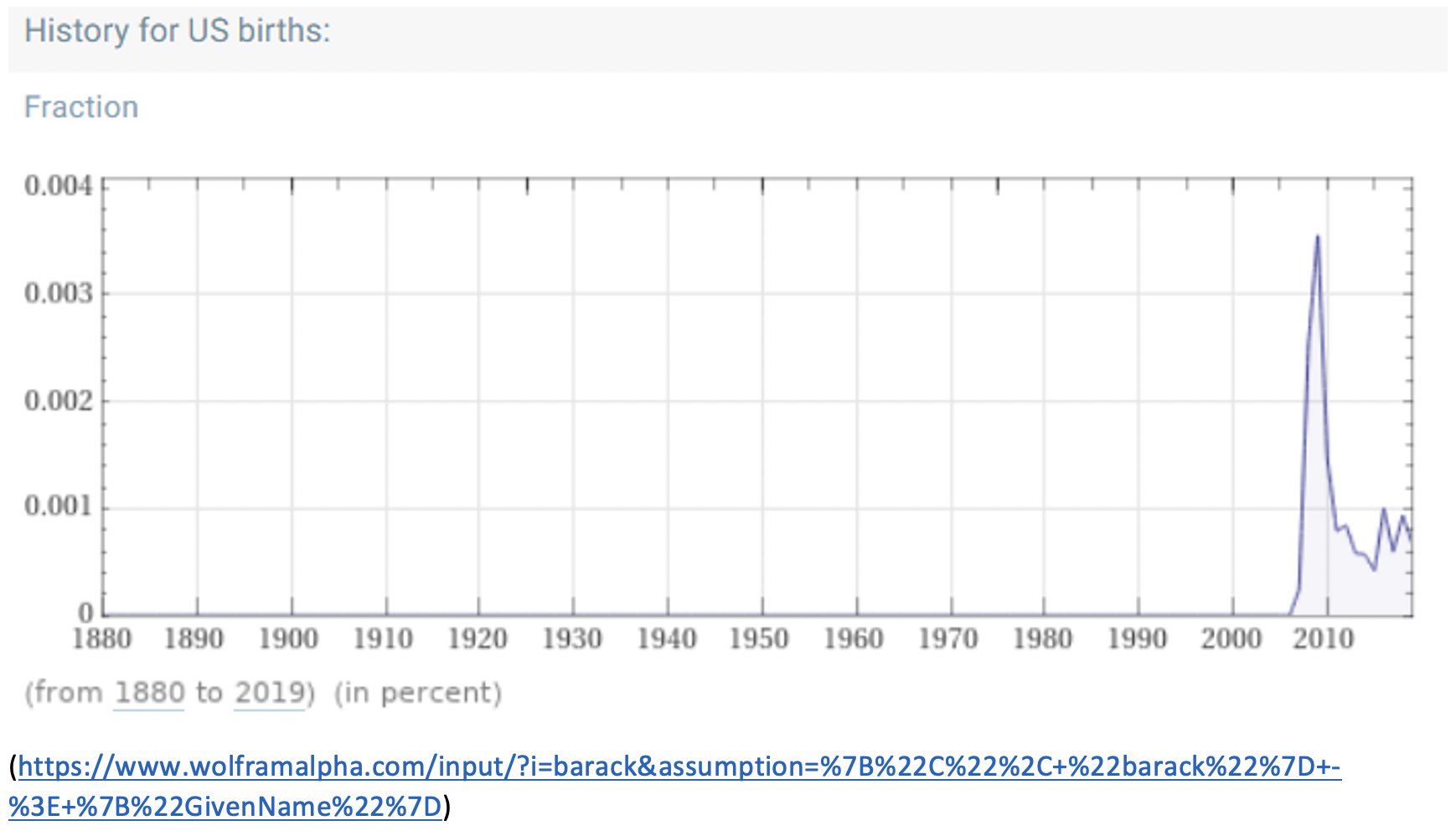
One interesting thing to note on these graphs is that the scale on the y-axis is not always the same. The peaks for the graphs of Sarah and Donna are at over 1.5% of babies born in a given year. The peak for Barack is at about 0.0035% of babies born that year.
A few notes about exploring names with WolframAlpha
- It’s important when looking at data to know where it comes from. WolframAlpha gets these numbers from the Social Security Administration.
- If you have an uncommon name, WolframAlpha may not recognize that you are looking for name data. You can fix this by adding the word “name” to your search.
- WolframAlpha may make assumptions about your search term that affect the results. The site lists the assumptions it made in a blue box at the top of the results. You can modify those assumptions if you need to.
How you can use this resource with your students
- Have them look up their own names or compare their name to a classmate’s. Are they surprised by what they find? Or does it confirm their lived experience?
- Do you have students who are thinking about baby names? They may want to look up the names they are thinking about to see how common or unique certain names are.
- Challenge students to draw connections between the different ways that information is presented in the search results. For example, WolframAlpha told me that the most common age of a Sarah in the US is 30. Where can I find evidence for that in the graphs?
- Click on the “more” button at the top right of the history graph to see even more graphs. What does each graph show? Why are the shapes similar or different? What is the y-axis measuring on each graph?
- Ask your students what they see in their search results. They may surprise you!
There’s so much math you can explore with this engaging and personally relevant data. Clicking on links in the results may also bring you to interesting (although possibly not useful) information. For example, I discovered that the combined weight of all the Sarahs living in the U.S. is about 63,682 metric tons! What will you discover about your name? Go have fun!
Sarah Lonberg-Lew has been teaching and tutoring math in one form or another since college. She has worked with students ranging in age from 7 to 70, but currently focuses on adult basic education and high school equivalency. Sarah’s work with the SABES Mathematics and Adult Numeracy Curriculum & Instruction PD Center at TERC includes developing and facilitating trainings and assisting programs with curriculum development. She is the treasurer for the Adult Numeracy Network.