Why Is Contrast Important?
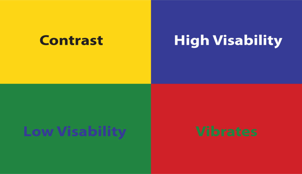
Visual contrast allows us to read and view more comfortably because it prevents elements from “blending in” with each other. Contrast through color, shading, or both makes elements “pop” in a way that makes them easier to distinguish. Contrast can also be used as a visual cue to indicate different sections of a text quickly.
When checking for proper contrast,
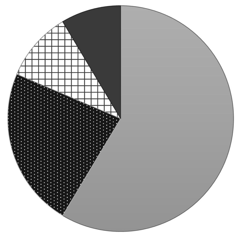
- be sure content is easy to understand when printed/displayed in black and white. Colors that are too similar to each other may be difficult to distinguish if they appear as shades of gray. If colors must appear in shades of gray, adding some texture can make it easier to tell different components apart.
- be sure people who are colorblind can distinguish elements from one another. Find great tips at the website A Guide to Making Your Website Accessible for Color-Blind Users.
- be sure elements are dark enough to distinguish from the background color of the paper or the screen. Use this free tool to plug in web colors and styles and test their accessibility!